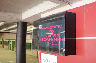
I think this photo follows the rule of simplicity, it's straight forward and the background is nice.
Another simplicity, my subject is clear and the background fits the time period in which this was taken school
My least favorite pictures, lines are major in this photo, on the ceiling, the hallway, the white line leading to the actual subject.
One of my favorite photos on here, I believe this is rule of thirds, my subject is clear and the background is completely blurred allowing just the subject to take the spotlight.
Framing, repetition amongst the pillars themselves are creating this void that looks like it gets deeper and deeper.
Bad merger, the pipe in the background looks like it's coming out of the can of chips and the lighting is horrible.


I liked your framing photo and how you gave it depth by coming so far out, showing that form of repetition. I also liked your rule of thirds photo and how you just focused on your main subject. In my opinion, in your lines picture, the subject isn't very clear. In addition, the simplicity picture has sort of a distracting background. Overall, you have good photos and ideas!
ReplyDeletei liked your first simplicity photo it was clear that you wanted us to see the rose and not really care about the background, i also liked your framing picture it made a really good and kinda continuous frame for the door. On your rule of thirds photo i would say its more of a simplicity photo than a rule of thirds photo because it was obvious what we were looking at the necklace
ReplyDelete